Overview
Crate and Barrel’s Customer Service was receiving a high volume of phone calls on the daily.
The overwhelming number of phone calls resulted in even longer delays in processes and orders. They needed a quick solution in order to lower the phone calls and focus on the demand for products.
Timeline & Status
2 months, Launched in September 2020
My Role
Product Design Intern - Treejack testing, competitive analysis, information architecture, high-fidelity prototyping
Team
2 product managers, 1 researcher, 2 developers
The Problem
In 2020, COVID-19 unexpectedly changed how companies functioned, shifting consumers to online shopping. With more people indoors and shopping online, Crate and Barrel had an uprise in sales, but this exposed some underlying issues.
In the Customer Service Department, there was a high volume of customer support calls causing delays in processes and orders. Due to poor organization on the customer service page and being outdated, many customers were unsuccessful in navigating the customer service website. Concerns rose about the companies performance and preparation for the holiday season.
The Solution
Revamped Crate and Barrel’s Customer Service page to enhance user experience.
Overhauled the information architecture, empowering customers with intuitive self-service options.
Streamlined access to vital information and support, ensuring a seamless and efficient resolution of queries.
Click here for the live website.
But Elena, how did you create the final product?
UX Research Method and Validation
01. Audit
02. Heat Map, Click Rate Validation and Tree-jack study
03. Competitive Analysis
04. Stakeholder Interviews
UX Research Method 01: Audit
I conducted an audit to understand what are the pain points of the current page.
Findings:
Word Heavy: Intimidating and lacks the use of icons and illustrations. Customers may feel overwhelmed. This may lead to the customer calling customer service.
Long forms, complicated layouts, and heavily written descriptions can increase distraction and cognitive load (working memory).
Lack of organization and hierarchy: The lack of organization leads to misdirection on the site. When the customer first lands on the customer service page, their eyes go straight to Crate and Barrel’s Contact Information.
UX Research Method 02: Heat Map, Click Rate Validation and Tree-jack Study
It was clear that we needed more insight to understand the user’s pain points and struggles on the customer service page. We needed to validate our audit.
I sought help from a researcher at Crate and Barrel to conduct a heat map and click rate study, collected insight from OpinionLab about customers’ experiences, and conducted a tree-jack study (reverse card-sorting).
Research Findings
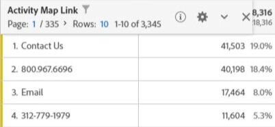
Based on the heat map and click rates, “Contact Us” was the most clicked from January 2020 - July 2020 via desktop and mobile.
Through Opinion Lab, I was able to discover the three top questions: how to cancel, track, and modify their order.
This arose concerning as these are actions the customer should be able to do on their own.
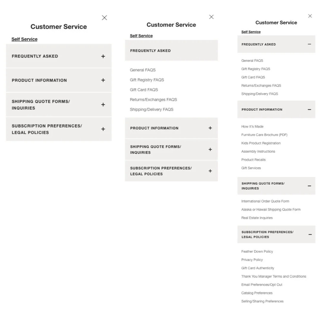
I conducted a tree jack study to measure the success rate users’ had in completing tasks. Ultimately, the study revealed how customers were unsure how to navigate our customer service navigation bar.
UX Research Method 03: Competitive Analysis
In collaboration with the Product Manager, we discovered that previous return experiences affected customer’s opinions on whether they would continuing purchasing from certain brands.
While this brought insight into what should be featured more clearly on our Customer Service Page, it also allowed us to dive deeper into our competitors to discover how they retain their customers.
We looked at 10 competitors to understand how they emphasized self-service. This led to the creation of our final design. Some common patterns appeared on our competitors:
The Use of a Search Feature:
This would allow users to easily search up their answers, making the experience fast and efficient.
Highlight on Self-Service:
This would emphasize the use of self-service before the customer decides to call.
Contact Information at the bottom of the page or not shown at all:
This highlights the Self-Service feature by placing the contact information at the bottom.
UX Research Method 04: Stakeholder Interviews
I interviewed the Customer Service team to understand their pain points, wants and needs. Their main focus was to bring the call numbers down due to the overwhelming response they are receiving on a daily. This interview resulted in the creation of a key feature on the customer service page: a self-service bar!
With the data collected from the heat map and click rate, I was able to choose six main self-service options that customers commonly looked and asked for.
Design Iterations
Based on the tree jack study, many customers had a difficult time navigating our customer service navigation bar. To solve that issue, my product manager and I re-organize and re-labeled the navigation bar.
Design Decisions
There was a big decision to either hide the Customer Service contact information or to reorganize the hierarchy in which the contact information is presented.
The Customer Service team voted for the contact information to be hidden, but there was one problem: The importance of appearing honest to the customers was a greater business need.
The Customer Service team emphasized the importance of appearing honest to their customers. After debating between the two options, the companies appearance was more important to prioritize. I decided to design the Contact Information to be placed at the bottom of the page.
Iterations
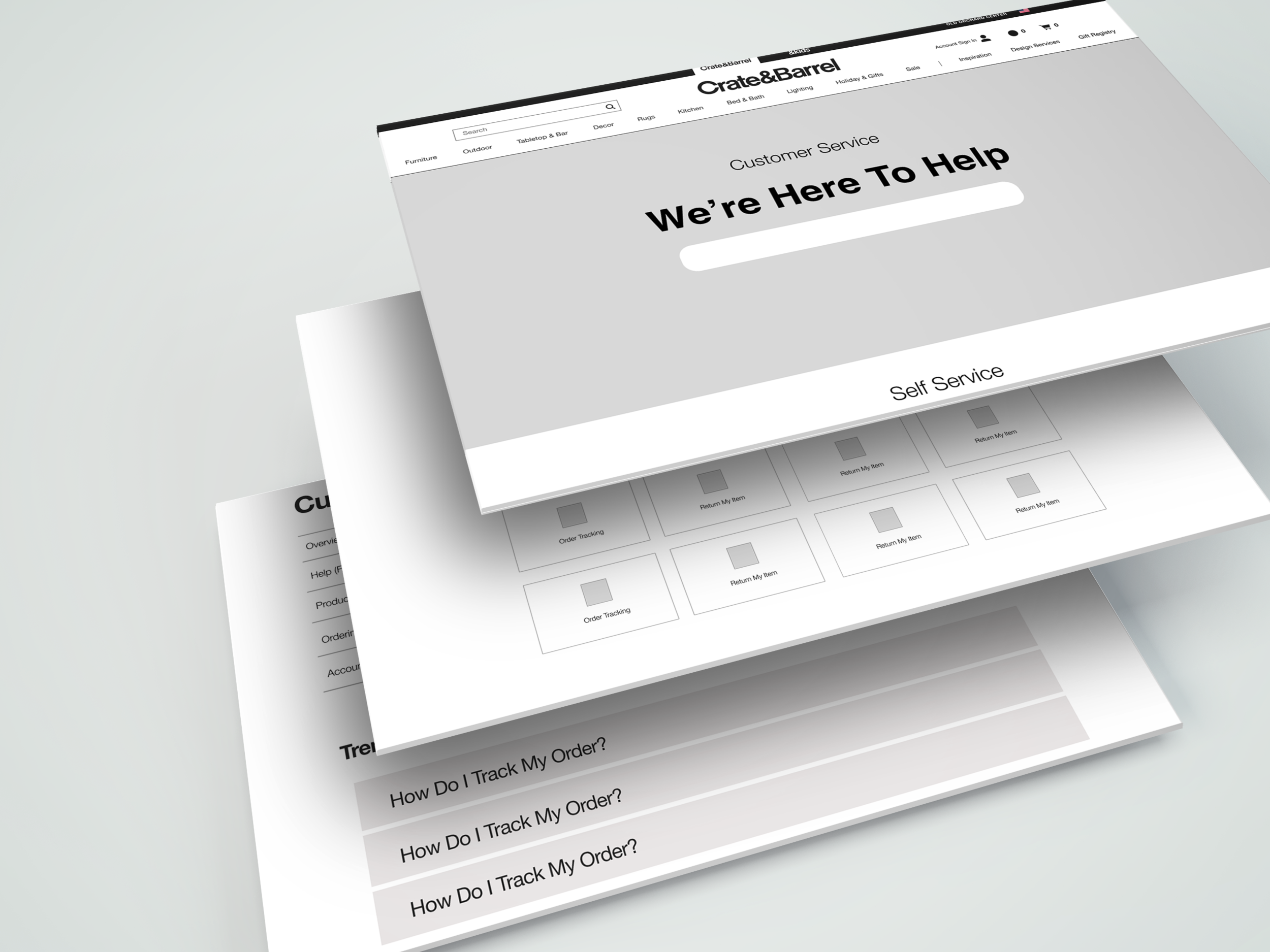
I prepared three wireframes to present to the developers and design team.
There was one particular design that I believed would have been a suitable feature for the Customer Service Page. I designed a search feature that would allow customers to quickly find their questions. Unfortunately, the developers quickly brought to my attention that this would not be possible. Although the search feature was preferred by many, the developers opened their concern that there would be more pages on the website that would need restructuring to make this happen.
With this new design, a 10-week project would turn into a one-year project. This design is something that Crate and Barrel can work on in the future, but they are in need of a quick solution to solve the problem. We resulted in designing the self-service bar as the main feature.
Retrospective
In my 10 weeks with Crate and Barrel, it truly was an eye-opening experience to work next to developers and designers.
This was truly my first ever UX Project with real life experience that I had the opportunity to work on. One thing I got out of this experience was the opportunity to collaborate with talented developers. With developers in the equation, I had to learn the limitations of design and software and finding compromise. This brought challenges to ideas that I had, but this is what UX Design is about.
Key Takeaways:
Exploration: I was able to find inspiration from other websites. It allowed me to follow trends and explore possible options to fit Crate and Barrel’s wants while solving the main issue that customers have.
Research, Research, Research: As I started to implement designs, I became bias and favored one design more than the other. With research, it made it undeniable that the design that I once favored is not the design that would work best for the customer. I had to refresh my mind and make rational decisions based on the data.
Time is ticking: With only 10 weeks to complete this project, there was undeniably more research that could have been done. I would have loved to have seen customer feedback on the new design to continue iterating and improving the experience, but all good things must come to an end.


